The Logo

LOGO FILM
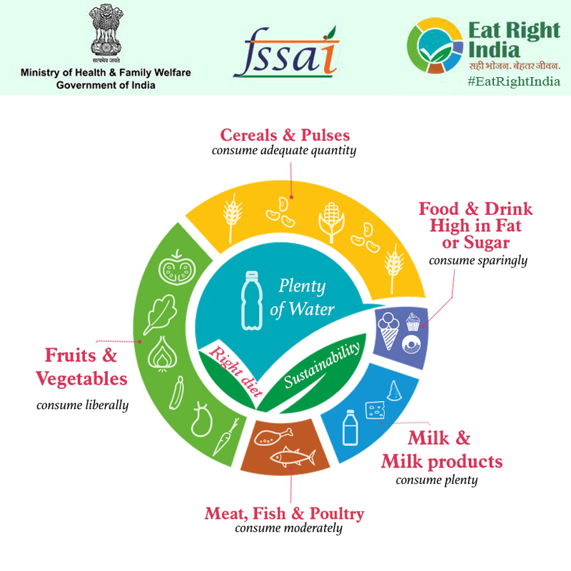
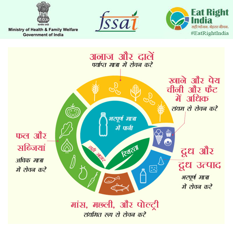
The Eat Right India Logo represents a healthy 'Indian thali' (plate) to ensure a balanced and wholesome diet comprising all food groups in the right quantity for good health. Each colour in the logo represents a food group and its corresponding nutrient category that is required by the body. The size of its arc represents the proportion of that food group to be consumed for optimum health of the body. The green leaf represents responsible and environmentally sustainable food production and consumption to protect the health of the planet.
Yellow represents cereals and pulses to be consumed in adequate quantity, dark blue is for milk and milk products, aqua blue for water to be taken in plenty, green for fruits and vegetables to be consumed liberally, brown for meat, fish and poultry to be taken moderately, purple for food and drink high in fat or sugar to be taken sparingly.


The six colours also signify the six tastes as per Ayurveda that are necessary for energetic effects on the mind and body as suggested in Charaksamita. These include sweet, sour, salty, bitter, astringent and pungent tastes. Each of these six tastes are required by everyone though relative proportions differ according to the constitutional or humor type of particular individual.
The sweet taste gives strength to the tissue elements, is good for nourishment, and harmonizes the mind. The sour taste stimulates the digestive fires and enzymes. The salty taste stimulates digestion, clears obstruction in the channels of the body, causes sweating, and increases the power of digestion. Pungent tastes improve metabolism and dilate channels in the body. Food with bitter taste eliminate bacterial elements, purify the blood and are light on digestion.
